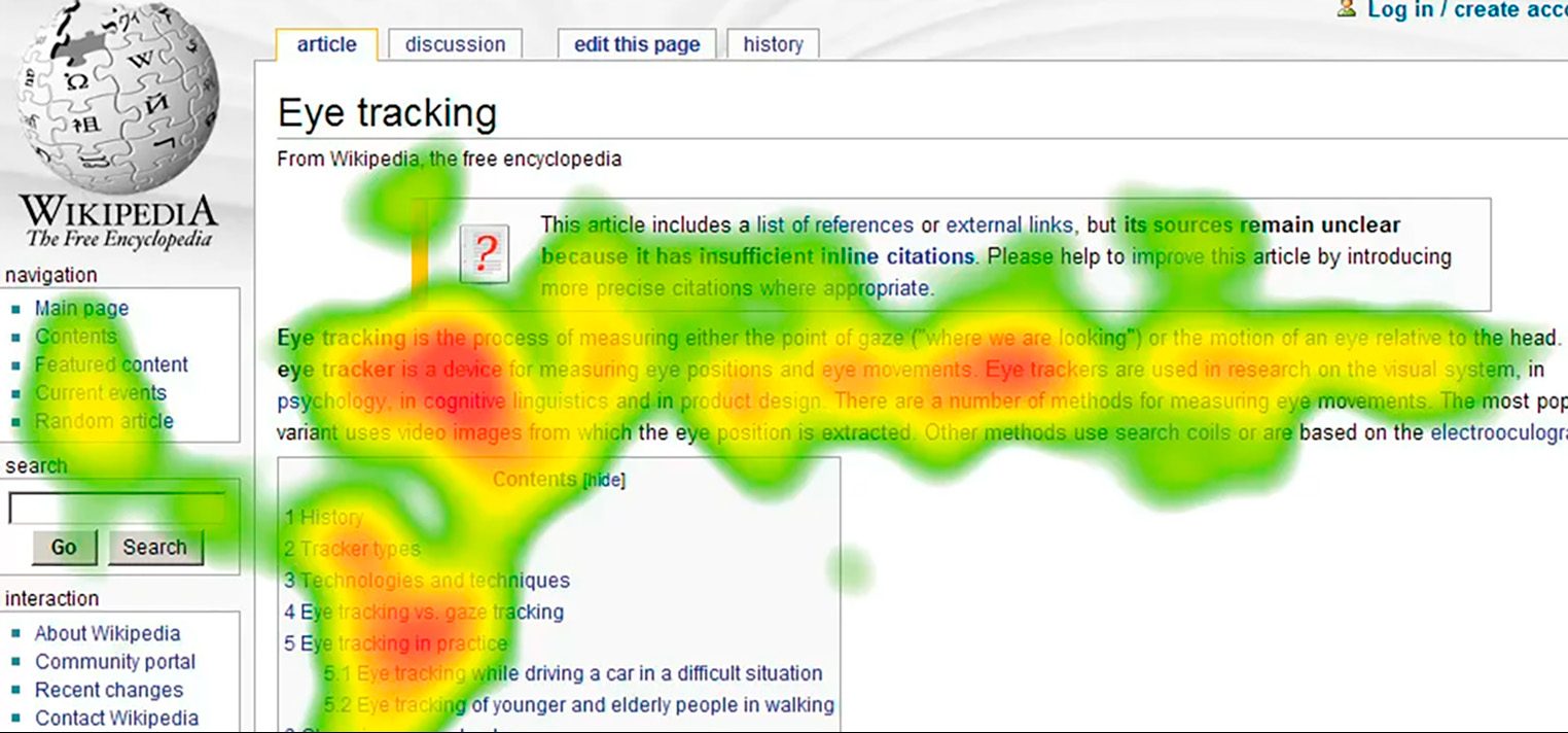
A heatmap, a tool increasingly becoming vital in the digital marketing sphere, allows marketers to gain insight into where page users spend their time, providing pivotal data that allows for targeted improvements of websites. Seeing what a site’s visitor is doing is informative about aspects of the website that a user likes and ones that they don’t.
Heatmaps are interesting and nice to look at, but their usefulness lies more in the information they provide rather than their visual appeal. They serve as one of content marketing’s top analytics tools because they allow access to key data that can help pages attain better results.
What Heatmaps Are
Heatmaps are a pivotal market research tool that helps in distinguishing parts of a site where users’ attention is high, and where it isn’t, by allowing the brand reps to have visibility about which parts of their websites visitors are looking at and clicking around in the most. This allows for a high level of visibility about the parts of a website that users interact with the most.
Heatmaps render this vital information through graphical elements which denote which parts of a site visitors, click, scroll through, and hover their mouse over the most. Those parts with higher interaction metrics are clearly more popular, allowing web-responsible members of the brand to focus on what makes the popular areas attractive to users, then apply those principles to other areas of the site.
The Three Types Of Heatmaps
Overall there are three distinct types of heatmaps used for researching and improving websites:
- Click tracking
- Scroll
- Segment heatmaps
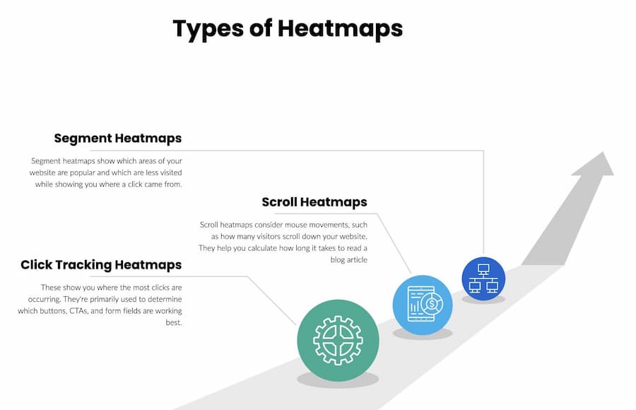
Click tracking heatmaps
As the name denotes, this type of heatmap shows which site parts get the most visitor interactions. These are areas with the most concentration of clicks, usually on buttons, form fields, CTAs, and other features that will allow a site master to understand which features are working best.
By knowing which parts of the site get the most clicks, designers and site heads can quickly assess which button types and call-to-actions are the most effective, and determine which areas require optimization to achieve a more effective site. The areas or entities that are clicked the least should be compared to those that are clicked the most to see what the differentiating factor is, and make optimization changes accordingly.
Let’s consider a site that uses three colors for its buttons: red, yellow, and blue. A heatmap might show that the red buttons get far more clicks due to their attention-grabbing nature. Similarly, the site might use multiple CTAs, but the heatmap might show that the most successful in terms of clicks are those that read “Continue.” Knowing this information allows brands to update their sites, adjusting the areas with fewer clicks to generate more activity through heatmap analysis.
The disadvantage of a click-tracking heatmap is that while it is fantastic at tracking mouse clicks, it isn’t clear about mouse movements.
Scroll heatmaps
Scroll heatmaps take into account mouse movements on the site, at least as it specifically pertains to the number of visitors that scroll down a site. These heatmaps operate by a coloration principle; the warmer the color, the more visitors scrolled to a particular part of the page. The areas where colors are cooler and fainter indicate areas less visited by customers.
These heatmap types are useful for determining how long it takes an average viewer to read through a blog post. Areas that are more attention-getting may also contain specific links inserted on the page. If the average time to read the blog post is 3 minutes, but the part with a particular link takes 5 to get to, that link is unlikely to be getting a lot of attention. This leads to the general efficiency rule of design that dictates that links should be placed earlier on a page in order to capture greater audience attention, especially if they point to a product or service that the brand is attempting to promote.
Segment heatmaps
Websites are always broken down into sectors or segments, and some will get more user attention than others. Segment heatmaps help to figure out exactly this information. However, they provide more information than just which segment gets the most action. They can point to what activities led to the click, allowing for that data to be considered during evaluation. Rather than considering the geographical location of the user, however, this would indicate if a visitor linked via a social media post, a PPC-based ad, or they arrived at the site organically.
Why is this important? Knowing the source of where the majority of visitors to a site comes from allows for the site to cater overwhelmingly to the needs of traffic from those sources. For instance, particular social media platforms may be driving more traffic to the site than others. Therefore, segment heatmaps provide source data, as well as demographic data about a site’s visitors.
Using Heatmaps To Generate Succesful Content
After understanding the various types of heatmaps, the next step is to understand how to use them effectively to improve the user’s experience, as well as conversion rates, at sites.
1. Generating Visually Attractive Material
Scrolling heatmaps allow site-runners to have a firm grasp of on-site marketing. Most site designers and managers are aware that not too many viewers like arriving at a site to find a straight wall of text. There is little appeal in that. Instead, they are attracted to the site’s visuals, including coloration, pictures, and videos.
Heatmaps allow for a quick assessment of whether particular images, for instance, are attractive to viewers. If viewers scroll down to the image, it indicates partial success, but if that image has an associated link and the viewer clicks on it, then the image is obviously effective. Unfortunately, not all images generate desired clicks, so experimentation with various images will be necessary. It may take a bit of time, as well as trial and error, but eventually, an image that successfully solicits more attention can be found.
2. Quality, Clear, And Transparent Blog Posts
Heatmaps will show how much of a blog article is being read. If visitors are routinely failing to complete the article, or the majority drop off after a certain point, some adjustments need to be made. One step is to consider simplifying the website to reduce the clutter, though the quality and contemporarily relevant nature of the articles should not be changed. Outdated articles will hardly ever get any attention.
3. Improving Conversion Rates
If a website has low conversion rates, click-tracking heatmaps can be one of the best tools to use to find out what CTAs are not generating desired clicks. Call-to-action prompts should be placed in highly visible places, especially where heatmaps indicate a lot of user interactions with the site. By placing links and CTAs in more “heated” parts of the site, the chances of them being clicked increase.
Conclusion
The fact that heatmaps, when leveraged correctly, will dramatically help to improve a site is quite indisputable. They help to identify the high-priority areas of a site, allowing designers to figure out what makes those areas successful, and apply those principles to the less successful sectors.
The tools noted above, as well as A/B tests, are very helpful in finding the most successful blog posts. Then it is a matter of figuring out what draws viewers to the successful places, and working to improve a site to yield a better conversion rate, as well as a more optimal user experience.